Andy Walker / Android Authority
TL;DR
- Android Auto is working to implement home screen widgets.
- The latest beta suggest users will have additional widget placement options than we saw before.
- Android Auto also appears to be preparing an alternate layout for its bottom navigation bar.
Who doesn’t love widgets? If you’re not already taking of them on your phone, you are seriously missing out, and lately we’ve been getting excited about them coming to our cars. Android Auto is working on widget support, and we’ve now spotted some new options for how those widgets will work.
We’re looking at Android Auto version 15.7.654604-release beta, and compared to the last time we checked in on the options Google was developing for Auto home screen widgets, the UI shows new controls:
While before we only had that scaling component, we now find a new height slider, as well as options for placement. And like we mentioned last time around, that “Earth” label is a codenamed we’ve identified as referring to Android Auto Widgets.
We also find that new “Screenshot” button in the top-left. Like the rest of this, that option isn’t yet working for us, and we’ll be curious to see if it sticks around for the public release, or if this is more of an internal tool.
Don’t want to miss the best from Android Authority?


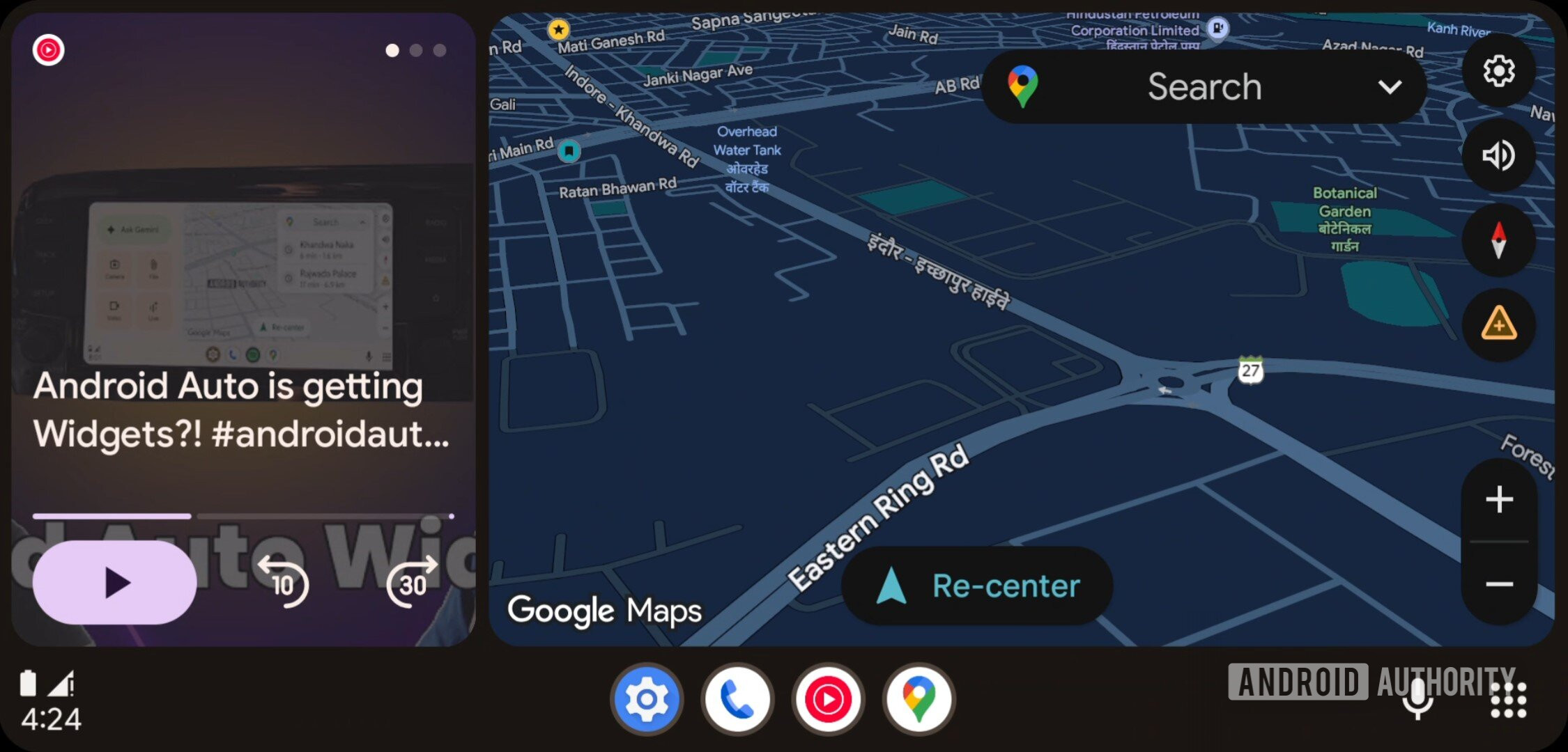
Beyond that tweak, we’ve also spotted what appears to be a new option in the works for Android Auto’s screen-bottom navigation rail. Right now what we have is very spread out, with apps in the middle, clock on the left, and buttons on the right:

AssembleDebug / Android Authority
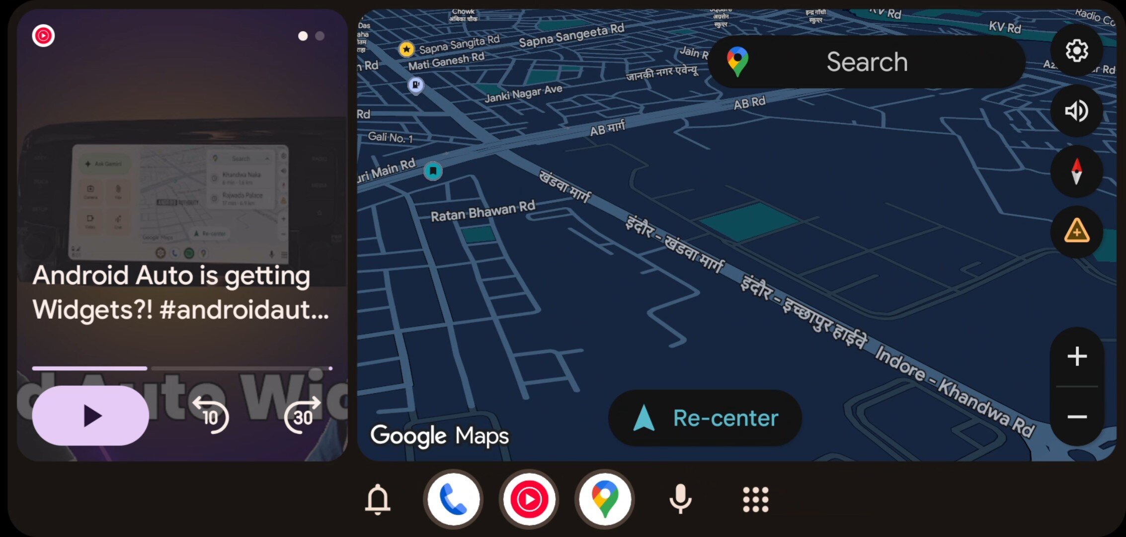
If you find yourself thinking twice before reaching for your Android Auto screen, making sure you’re tapping in the right place, you may prefer the simpler arrangement of this alternative layout we’ve identified:

AssembleDebug / Android Authority
With this view active, Android Auto condenses everything into the middle. There are some casualties along the way, as we lose that convenient time display and get access to one fewer app — and honestly, we’re not quite convinced that this might be a change for the best. But it’s also one that’s not currently active, and Google can take all the time it needs to iterate upon options like this one before it decides to run with any.
We’ll keep looking to identify those, and share any more tweaks to these features Google ends up implementing.
⚠️ An APK teardown helps predict features that may arrive on a service in the future based on work-in-progress code. However, it is possible that such predicted features may not make it to a public release.
Thank you for being part of our community. Read our Comment Policy before posting.
