
Summary:
iOS 26’s visual language obscures content instead of letting it take the spotlight. New (but not always better) design patterns replace established conventions.
With iOS 26, Apple seems to be leaning harder into visual design and decorative UI effects — but at what cost to usability? At first glance, the system looks fluid and modern. But try to use it, and soon those shimmering surfaces and animated controls start to get in the way. Let’s strip back the frost and look at how these changes affect real use.
Liquid Glass: Apple’s New Visual Language
iOS 26 introduces Apple’s new glassmorphic visual language into its phones.
Apple describes Liquid Glass as:
“a translucent material that reflects and refracts its surroundings, while dynamically transforming to help bring greater focus to content, delivering a new level of vitality across controls, navigation, app icons, widgets, and more.”
Translated: the interface now ripples and shimmers as if your phone were encased in Jell-O. At first glance, it does look cool. But problems arise as soon as you start using your phone.
Transparency = Hard to See
Liquid Glass makes UI elements translucent and bubbly. The result is light, airy — and often invisible.
One of the oldest findings in usability is that anything placed on top of something else becomes harder to see. Yet here we are, in 2025, with Apple proudly obscuring text, icons, and controls by making them transparent and placing them on top of busy backgrounds.
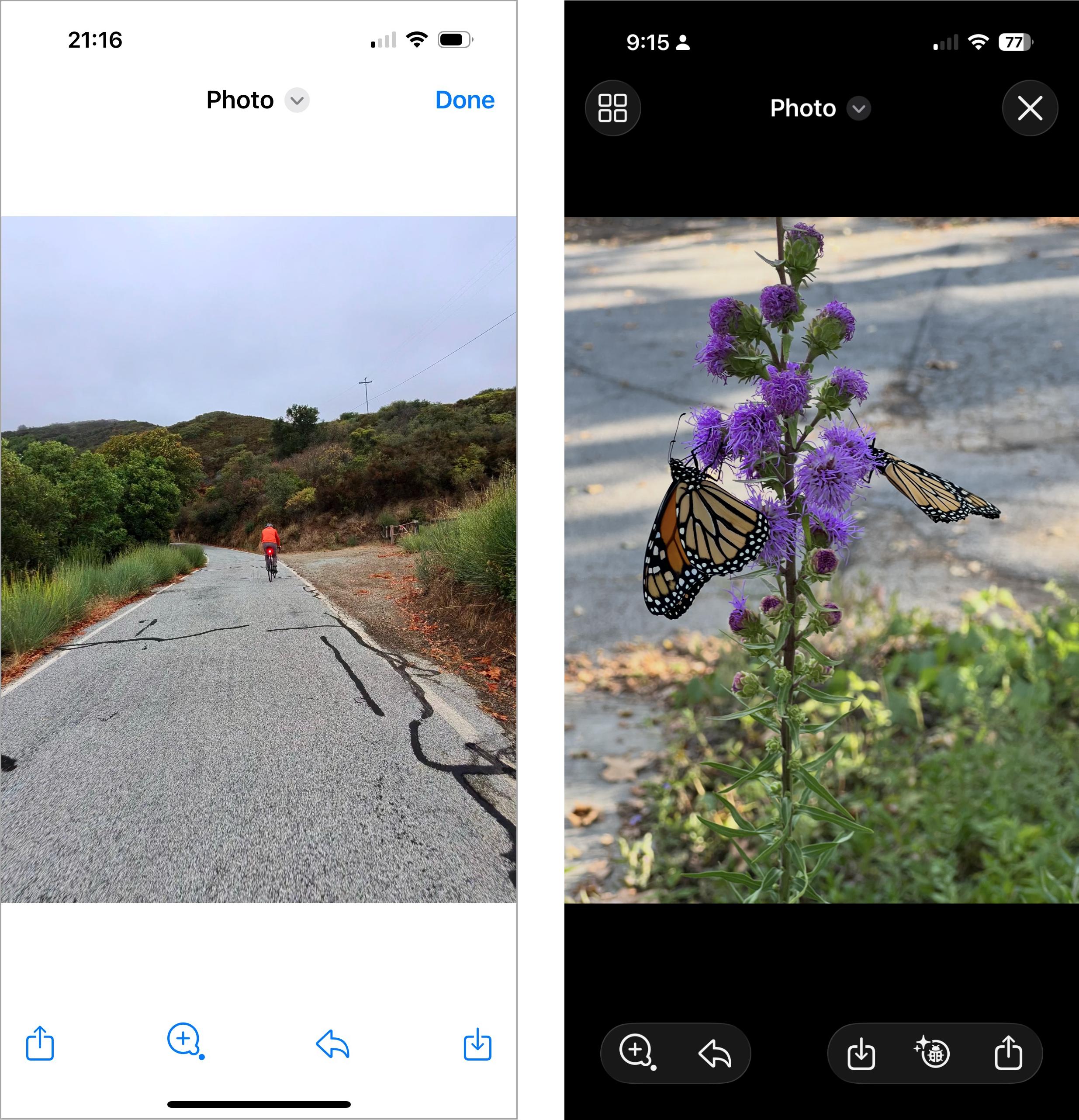
Text on top of images is a bad idea because the contrast between the text and the background is often too low. So why does Apple now encourage users to set photos as backgrounds for text messages?
The result is that your friend’s words are camouflaged against their beach-vacation photo, or worse, their pet’s fur. Content may technically be “in focus,” but you can’t read (or see) it.
And then comes Apple’s boldest (or dumbest) experiment: text on top of text. Apparently, designers decided users have eagle vision and infinite patience, because deciphering one line of text written across another is now fair game. Reading an email subject line now requires Dan Brown-level cryptographic decoder skills.
Not only is it illegible — it’s also ugly.
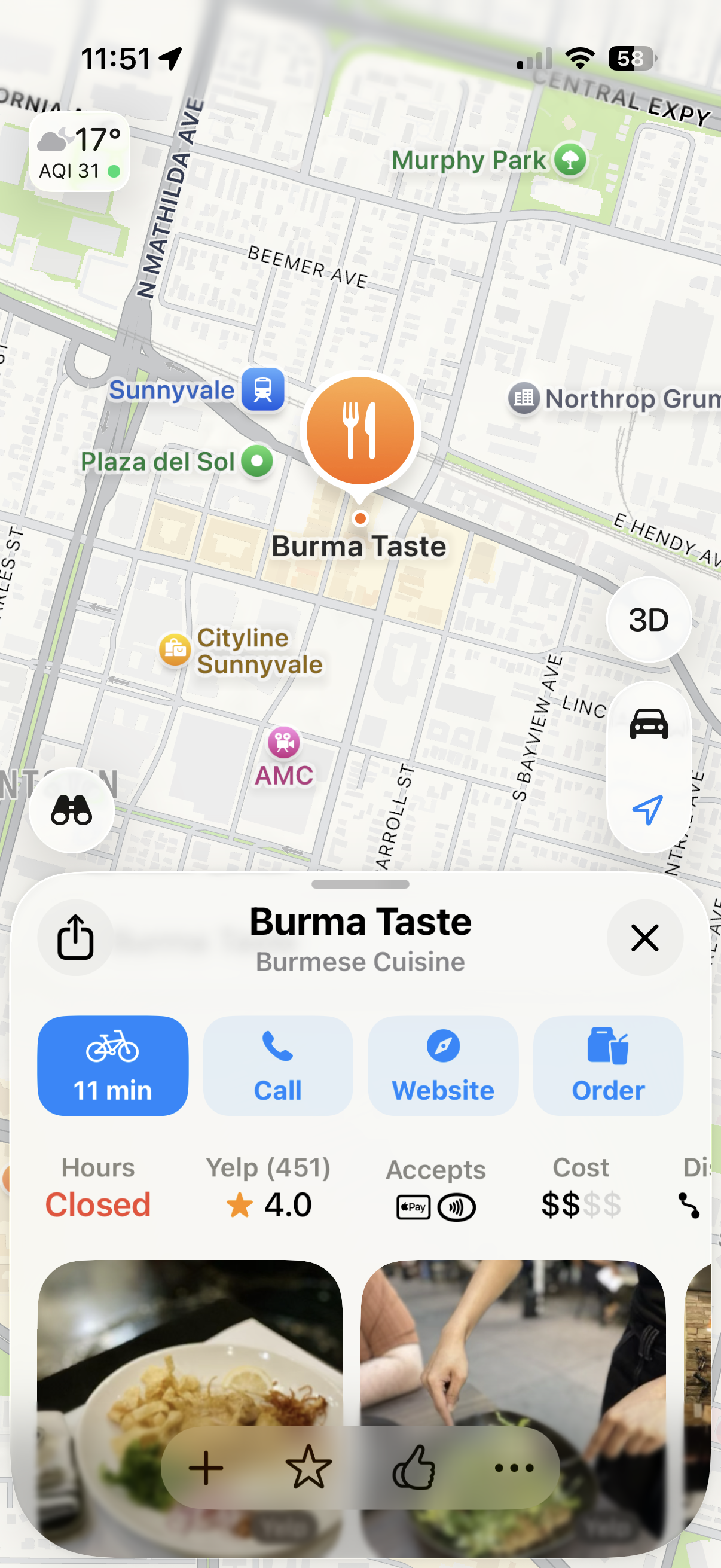
Semitransparent floating controls reign in iOS 26. Titles, search bars, tab bars, and even the phone status bar are now floating on top of the page. These not only obscure the page content, but also sometimes compete for attention with other page elements.
Animated Buttons: Motion Without Meaning
Animation can be delightful the first time. When used intentionally, they can also be satisfying — creating that feeling when something just “clicks” or “snaps” into place. Our eyes are finely tuned to detect motion, which is why animated buttons grab attention instantly. But delight turns into distraction on the tenth, twentieth, or hundredth time.
In iOS 26, controls insist on animating themselves, whether or not the user benefits. Carousel dots quietly morph into the word Search after a few seconds. Camera buttons jerk slightly when tapped. Tab bars bubble and wiggle when switching views, and buttons briefly pulsate before being replaced with something else entirely. It’s like the interface is shouting “look at me” when it should quietly step aside and let the real star — the content — take the spotlight.
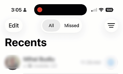
Even controls you didn’t touch can’t resist showing off. In the Phone app, switching from All Calls to Missed Calls mysteriously turns the filter button blue, as though missed calls deserve filtering but all calls don’t.
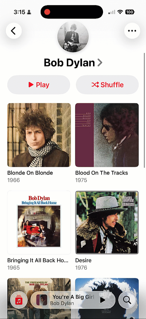
Meanwhile, in the Music app, the current song title ticks along like a stock-market ticker, shimmering with watery highlights as you scroll up and down. Reach the top of the page and — surprise! — the bubble leaps up to make space for the tab bar.
Motion for motion’s sake is not usability. It’s distraction with a side of nausea.
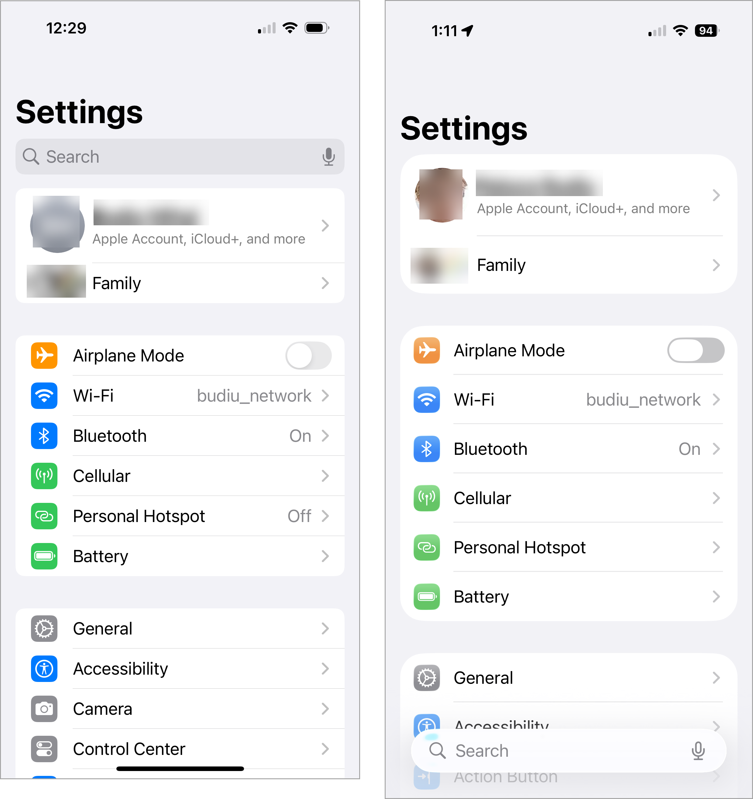
Crowded, Smaller Tap Targets
Apple has also decided it’s time to crowd and shrink touch targets. The long‑standing guideline of at least 0.4cm between targets (and 1cm × 1cm tap areas) seems to have been tossed out the window. Either Apple believes our fingers are getting smaller, or it assumes years of practice with smartphones have magically trained us to hit tiny targets with perfect precision.
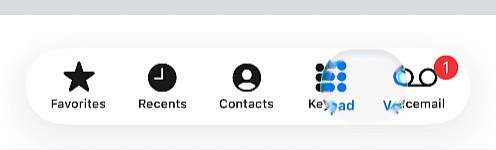
In iOS 26, tab bars show the results of this thinking: they feel cramped, squeezed to make room for the ever present search button that lingers in the bottom‑right corner of nearly every page.
Because this button hovers apart from the rest of the bar, navigation feels fragmented. One control floats off on its own while the others are bunched together, breaking the sense of a unified control area and making the whole bar harder to scan at a glance. The heavy emphasis on search feels borrowed from Google’s playbook, which is ironic given Apple’s reputation for building its own distinct design language.
Predictability, Lost
We’ve long known that constantly changing interfaces are a nightmare. Back in the day, Microsoft Office experimented with adaptive menus that reordered themselves based on recency. People hated them because nothing stayed where you left it. You had to rescan the menu every single time. The interface could not be learned because it was constantly changing.
Apple seems to have learned nothing from that lesson. In iOS 26, controls appear, vanish, collapse, and expand depending on context. The tab bar collapses whenever search is activated, making room for the field.
Safari adds its own twist: the forward button appears and disappears depending on whether there is a page to go forward to. While this may seem logical in theory, in practice it disrupts consistency: changing the size and location of a target makes the interface harder to learn and less predictable.
Instead of building reliable habits, users now have to play hide-and-seek with the navigation controls.
Changing Conventions
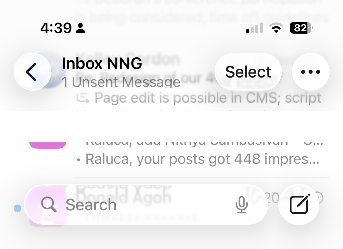
Search in earlier versions of iOS lived at the top of the page. In Mail or Messages, users had to scroll down to reveal the bar. It wasn’t the most discoverable pattern, but years of repetition made it second nature.
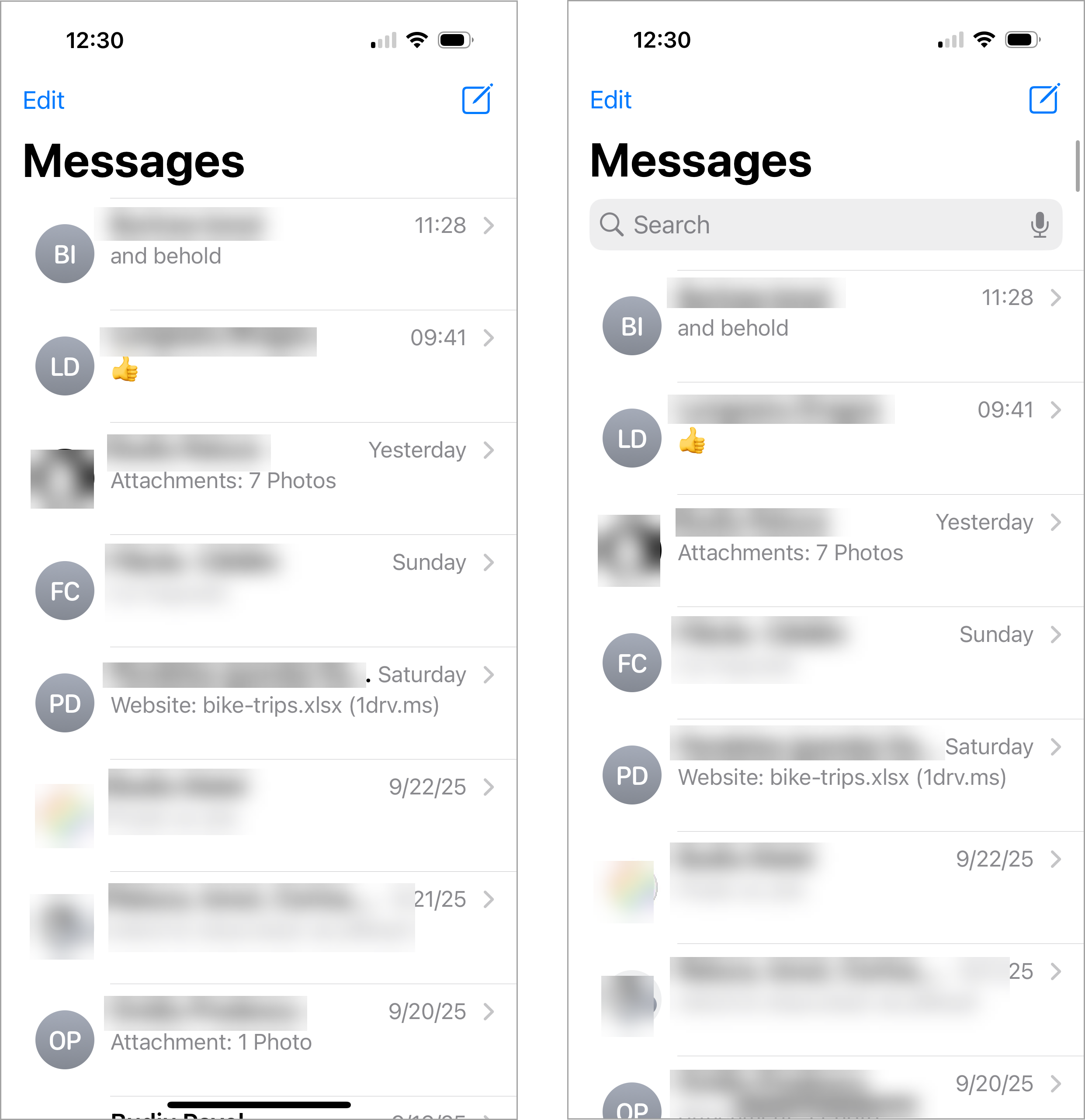
Now, in iOS 26, search has migrated to the bottom of the screen and is always visible. For newcomers this might feel easier to find, but for long‑time users it’s a jarring break from habit that slows them down until the new pattern becomes ingrained. (Even if the new pattern might prove beneficial over time, existing users must relearn it, which in the short run means lost productivity and added frustration.)
To complicate matters further, search is styled as a floating bar that sometimes interferes with page content. Its pale design also tends to fade into the background, making it easy to miss. In our past research on floating buttons, we found they work best when they stand out clearly — not when they blend in and risk being overlooked.
Discoverability in Decline
The back button, once a friendly guide accompanied by a breadcrumb, has lost its trail. Instead of showing where you came from, it has no label now, leaving users to guess.
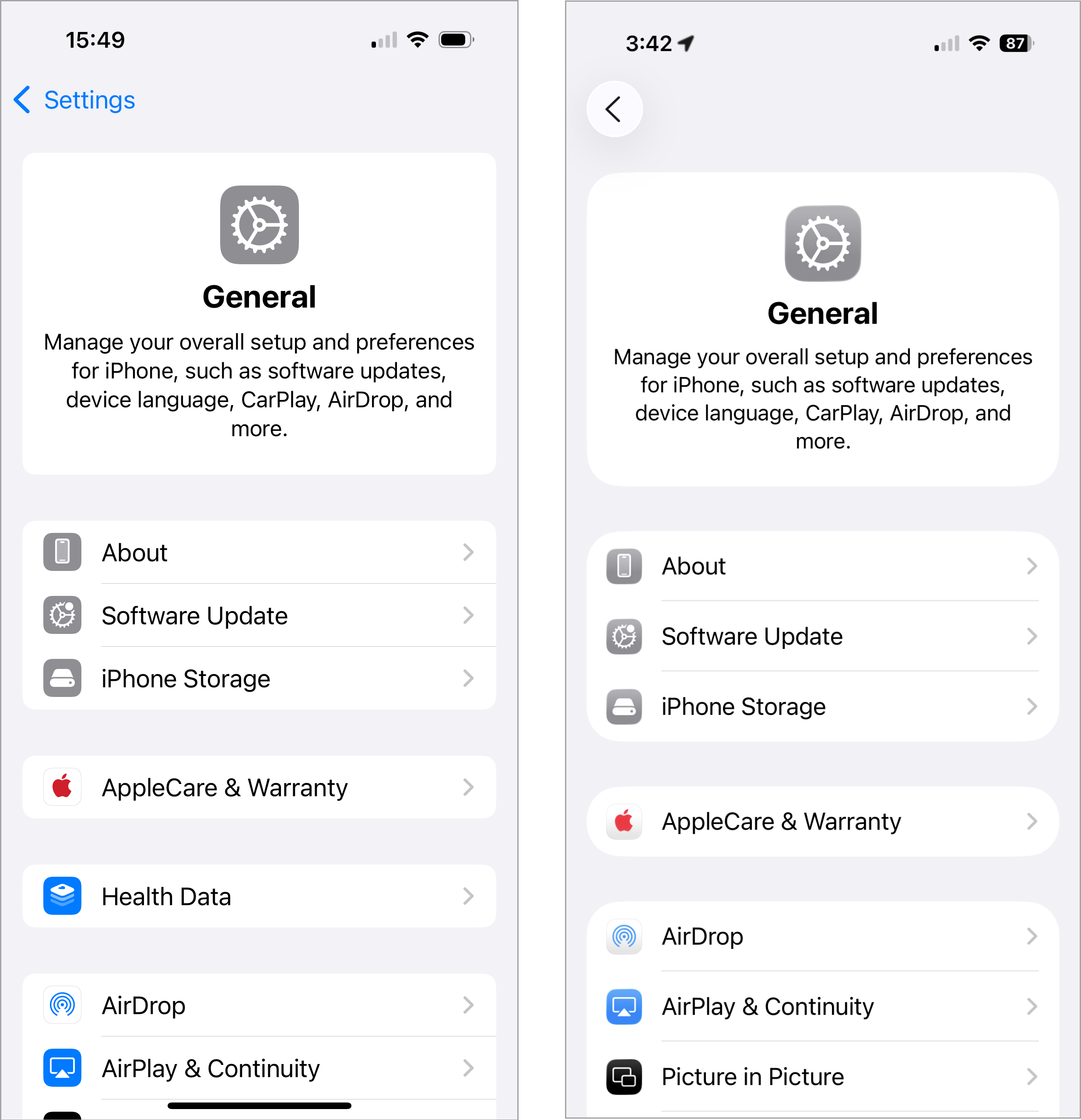
This signals another transition (this time for the worse) to Android-style design, where page titles are left-aligned (instead of center-aligned), thus displacing the breadcrumb next to the back button. This design choice has the potential to cause major confusion for users, as some apps will still use a breadcrumb next to the back button, while others may replace the breadcrumb with the current-page title.
Safari piles on with its own frustrations: the URL bar is squeezed between icons, truncated to the point where you can’t easily tell what site you’re on. And tabs, once a single tap away, are now hidden in an overflow ellipsis menu that demands extra steps. Not only does this design violate best practices for overflow menu (which requires that only nonessential actions be hidden there), but every additional tap is another second wasted — multiplied by the millions of times users switch tabs each day.
The Bigger Picture
iOS 26 brings Liquid Glass controls laid over noisy backgrounds, jittery animated buttons, shrunken and crowded tab bars, collapsing navigation, and ubiquitous search bars. On top of that, it breaks long‑established iOS conventions, getting closer to Android design.
Overall, Apple is prioritizing spectacle over usability, lending credibility to the theory that Liquid Glass is an attempt to distract customers from iOS 26’s lack of long-promised AI features.
The interface is restless, needy, less predictable, less legible, and constantly pulling focus rather than supporting seamless access to content. Instead of smoothing the path for everyday tasks, iOS 26 makes users relearn basics while enduring a constant parade of visual stunts.
Apple may call it Liquid Glass. To many users, it feels more like a fogged‑up window: pretty from a distance, but frustrating when you try to see beyond it.